 Back to blog
- What does responsive mean for restaurant websites?
- How to recognize a responsive restaurant website
- Benefits of responsive web design for restaurant websites
- 1. More traffic coming from mobile
- 2. Increased carryout and delivery orders from mobile users
- 3. Faster loading speed
- 4. Higher conversion rates
- 5. Better SEO
- 6. Simpler analytics
- 7. More affordable
- 8. Increased social media sharing
- Responsive restaurant website design example
- How to get the best responsive website builder for your restaurant
89% of dining research is done by mobile before visiting a restaurant. Therefore, if you don’t have a responsive restaurant website, you are missing out on a big pool of clients.
Moreover, if you don’t use adaptive web design, then you will get a lower Google ranking than competitors that use responsive designs. By improving your search engine position, you will attract more customers and earn more money for your business.
In this article, you will learn about the benefits of responsive restaurant website design and how to get it with low effort:
What does responsive mean for restaurant websites?
Responsive design is a type of web design that guarantees your website pages will render well on all devices or screen sizes. A responsive web design template will adjust and adapt automatically to fit your screen’s size, whether you’re browsing on a desktop computer, laptop, mobile phone, or tablet.
That way, your customers won’t have to zoom in to see your menu or scroll until their finger hurts to find your contact information. Such a negative experience will frustrate them and cause them to leave your website faster than you can say, “unresponsive.”
How to recognize a responsive restaurant website
A responsive restaurant website builder will ensure that your restaurant’s website has all of the features it needs to attract more customers. Some of the elements to look for in the best responsive restaurant websites include:
- Mobile SEO for Google that will boost website rankings.
- An online menu that mobile users can easily navigate through.
- A mobile-friendly online ordering system that helps customers place orders through their smartphones without problems.
- A reservation form that looks attractive on small screens.
- Delicious images that load quickly and drive customers to order more food.
Ideally, you should have a responsive restaurant website builder with already implemented mobile SEO and a great design.
 Read more:
Benefits of responsive web design for restaurant websites
Getting a responsive restaurant website will ensure your business’s success by helping you achieve the following:
1. More traffic coming from mobile
Your website will get more visits from people who use mobile devices to find restaurants near them. If their experience is positive and your website looks good on mobile, they will stay and order. This brings me to the next advantage of a mobile-responsive website for restaurants.
2. Increased carryout and delivery orders from mobile users
Without a responsive design and without hiring an illustrator, your homepage and menu may look incomprehensible on mobile devices. And so, clients looking to order may decide to go to your competitor’s website and order from there. However, switching to a responsive restaurant menu from a mobile-optimized restaurant website builder solves this problem.
3. Faster loading speed
Today’s customers don’t have a long attention span, especially when they’re hungry. One of the main benefits of responsive web design is that it allows your pages to load faster on mobile. Users tend to abandon pages that take more than three seconds to load. Keep them on your website with a Google responsive web design. This also translates into a lower bounce rate as you will tempt users to explore several pages on your site if it loads fast.
4. Higher conversion rates
How do you convert website visitors into customers? With a mobile website design that offers a flawless user experience. If visitors can easily find the order or table reservation buttons, they’re one step closer to becoming paying customers.
5. Better SEO
Mobile-friendliness is a ranking signal for Google, so if you want to rank higher, you need a responsive restaurant website. Furthermore, having the same site for desktop and mobile prevents penalties from Google for duplicate content.
6. Simpler analytics
Instead of having two separate sites for which to keep track of funnels, conversion paths, and user journeys, with a responsive website, you can use Google Analytics for responsive reporting in a single report.
7. More affordable
Most responsive website design templates are quite affordable compared to paying separately for a desktop and mobile website. For example, our responsive restaurant website builder costs only $9/month.
If you have responsive social media buttons on your restaurant website, you increase the chances of users tapping on them and letting more people know about you. More shares = more potential customers.
Responsive restaurant website design example
Now that we’ve shown you the benefits of responsive web design, let’s look at some actual adaptive design examples from our demo restaurant website.
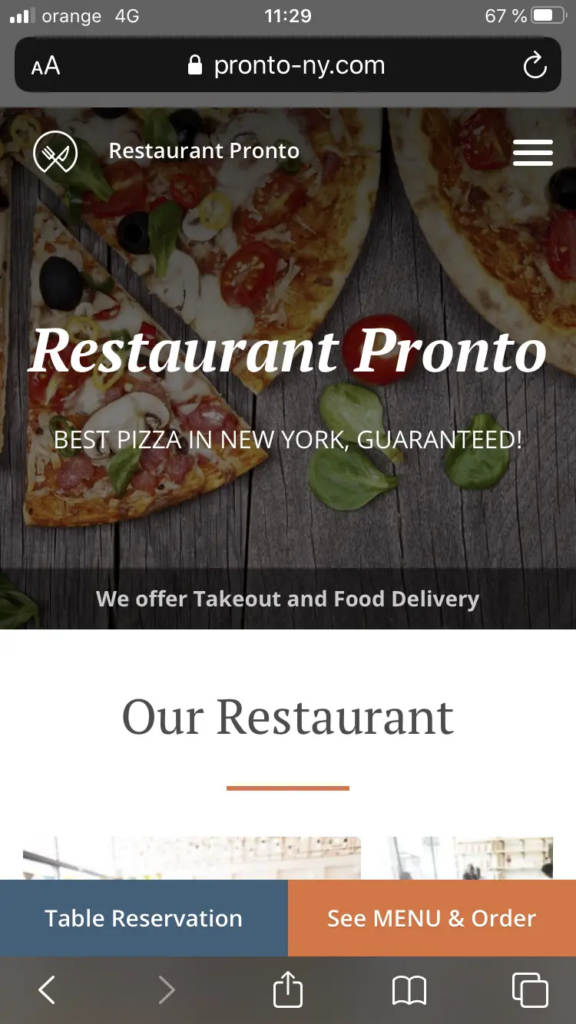
First, this is how your homepage could potentially look – no need to scroll or zoom in to see the table reservation and online ordering buttons.
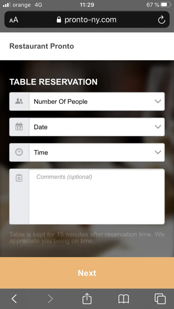
At one tap of the Table Reservation button, customers reach a responsive form where they are minutes away from booking a table.
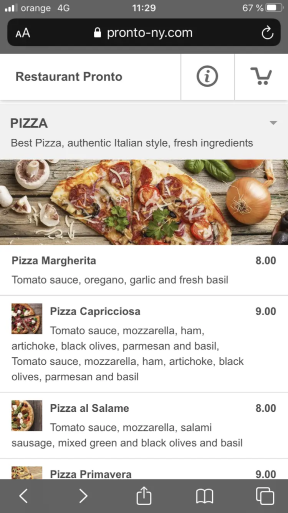
Tapping the See MENU & Order button takes them to an easy-to-browse menu where they can add dishes to their cart with one tap.
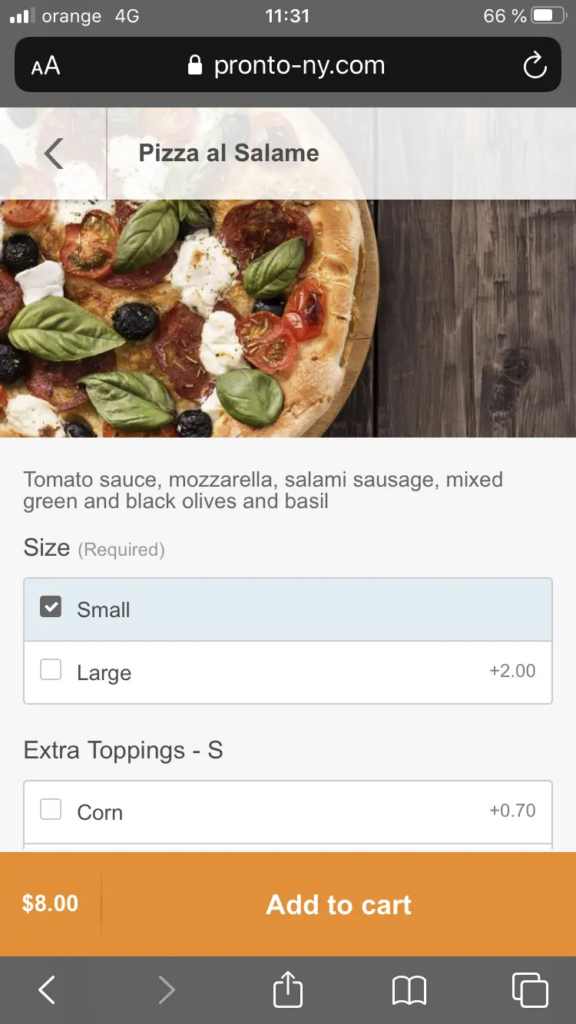
Finally, here’s another example of responsive web design on the customize your meal page. Customers can choose the size of the meal, the quantity, extra toppings, add special instructions, and more.
How to get the best responsive website builder for your restaurant
GloriaFood gives you access to the best restaurant website builder that you can use to generate a responsive website in less than 10 minutes.
Here are some of the essential features you will enjoy:
- Responsive restaurant menu templates that you can easily update.
- Templates that will make your homepage look gorgeous.
- Access to mouth-watering images that make clients order more food.
- Reservation templates that help people choose dates and times.
- Images and text that adjust to the user’s screen size.
Use this video tutorial to find out how to use our website builder to generate a responsive restaurant website.


- What does responsive mean for restaurant websites?
- How to recognize a responsive restaurant website
- Benefits of responsive web design for restaurant websites
- 1. More traffic coming from mobile
- 2. Increased carryout and delivery orders from mobile users
- 3. Faster loading speed
- 4. Higher conversion rates
- 5. Better SEO
- 6. Simpler analytics
- 7. More affordable
- 8. Increased social media sharing
- Responsive restaurant website design example
- How to get the best responsive website builder for your restaurant
Related topics


