- What makes a good restaurant website
- 9 Restaurant website design tips & ideas
- 1. Always think mobile-first
- 2. Choose an efficient restaurant website color palette
- 3. Create contrast and maintain consistency
- 4. Make the menu the main focal point
- 5. Use mouth-watering images to increase conversion
- 6. Make your headers work for you
- 7. Implement a visual hierarchy
- 8. Make your content readable at a glance
- 9. Leave space for integrations
- How to get the best restaurant website design
- Final Words
A restaurant website without a great design is like a restaurant location that is hidden in a building where you struggle to find a waiter. It exists, but it is not worth your time.
That’s why, in this article, we’ll help you get your business on the map and attract customers with easy-to-understand restaurant website design tips & ideas.
We’re taking a deep dive into what makes the user tick, color schemes, and how to design the structure of your website so that it’s easy to browse and intelligently structured.
What makes a good restaurant website
To answer this question, think about your restaurant’s website purpose. What do you hope to achieve with it? A good restaurant website must:
- Be easy to browse: clients must be able to use the website with no struggle, pop-ups, or a thousand clicks to get what they want;
- Have all important information easily accessible: location, contact number, menu, etc. All of these should be found at a glance on a good restaurant website;
- Lead customers to the order button: the order button must be placed in the most visible spot on the website to encourage people to order;
- Make online ordering a breeze: a good website will allow customers to order with just a few clicks, and no phone calls required.
Do you want to enjoy the benefits of persuasive restaurant website design without the effort?
Use our restaurant website builder to generate a sales and SEO-optimized website
9 Restaurant website design tips & ideas
No matter if you decide to take matters into your own hands or hire a designer, these are the rules you should follow to achieve a great restaurant website design:
1. Always think mobile-first
What device did you use last time you looked for a restaurant? If the answer was your phone, you are not alone. 89% of dining research is done by mobile before visiting a restaurant.
Therefore, it should come as no surprise that one of the best restaurant website design tips is to have a website that works just as well on a smartphone as on a desktop. Here is what you should look out for:
- Adaptive design: the size of the screen should adapt to every type of smartphone, with no icons left out of the screen that make the website hard to browse;
- Responsiveness: your restaurant website must load instantly if you don’t want people exiting it. Potential clients are expecting speed, don’t disappoint them if you want to win them over;
- Online ordering menu: forget about PDF menus that people have to download on their device or menus that are just an image that won’t fit on the screen of a smartphone. They will only make people go to the competition. Instead, opt for an online ordering menu you can add to your website in just 10 minutes:
Persuade people to order with an irresistible online restaurant menu
Enjoy the menu creator that comes with this intuitive restaurant website builder
2. Choose an efficient restaurant website color palette
Choose a color scheme for your restaurant website design that will make your food and menu items pop without distracting the user. Here are some restaurant website design tips to help you choose the best color for your business:
- Red and orange make you hungry: red and orange make us think about food and can trick us into a sensation of hunger, which means we’re willing to spend more;
- Yellow and green are good options: they are colors naturally found in the world of foods, so people will immediately feel comfortable seeing them on a restaurant website;
- Integrate your brand colors: your website is your identity card for people who haven’t visited you yet, so you must make your branding obvious. Take some of the colors from your logo and integrate them naturally into your website design.
3. Create contrast and maintain consistency
Imagine two blank sheets of paper. On one, you will write with a light grey, with a varying font size and random spaces. On the other, you use a contrasting black, the same font, and maintain consistency in spaces.
Which one do you think will be easier to read and understand? The same goes for your website. Use these restaurant website design tips to create contrast and consistency:
- Choose a font that’s easy on the eyes: special fonts are nice for logos and maybe a headline, if it’s just the name of your restaurant. For the rest of the page, use a no-frills font that is easy to read;
- Pay attention to font hierarchy: bigger font sizes emphasize something more important and will immediately draw attention;
- Adapt the font sizes for mobile devices: a large headline looks nice on desktops but it might take up the whole screen on a smartphone;
- White space is important: so don’t be afraid of “empty” pixels; these create a sort of breathing room for the eyes;
- Be consistent with spaces: try to have the same distance between sections on your pages.
Most people visit a restaurant’s website to search for the menu. They want to see what dishes you offer and what are your prices, and they want to do it fast.
Don’t make them search your whole website to find it or you risk them turning to the competition. Use these restaurant website design tips to guide visitors to the menu:
- Place the menu button above the fold: in the right side corner and a contrasting color to the background so it will pop up;
- Use a slightly larger font for the menu button: it will attract attention if it is bigger than the text around it. It should also be in a simple, easy-to-read font, so the clients understand immediately that by clicking it, they access the online restaurant menu;
- Have an intuitive online restaurant menu: that will guide people easily through the menu items, delivery information, and payment methods to checkout.
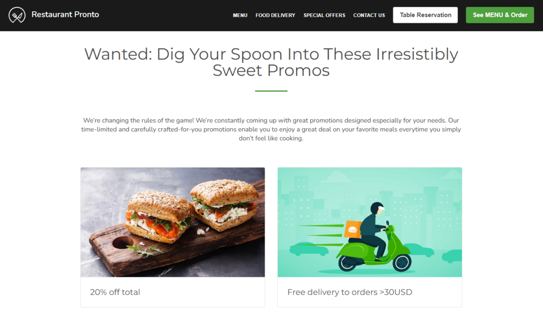
5. Use mouth-watering images to increase conversion
Imagine a hungry customer stumbles upon your website. If you have professionally taken pictures of your delicious dishes, they won’t be able to resist and they will click the order button.
If you have blurry pictures that don’t put your food in the best light, they might look elsewhere. Follow these restaurant website design tips for images that convert:
- Hire a photographer: or learn more about restaurant food photography to ensure your images make your food pop up;
- Include images in the menu: customers enjoy seeing what they’ll get and they’re more likely to buy something they can visualize;
- Optimize images for performance: Be mindful of your customer’s mobile data plan and optimize for the smallest of screens. For example, try to use an online file compressor for images to decrease the file size of your photos.
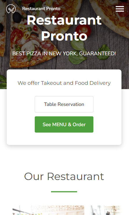
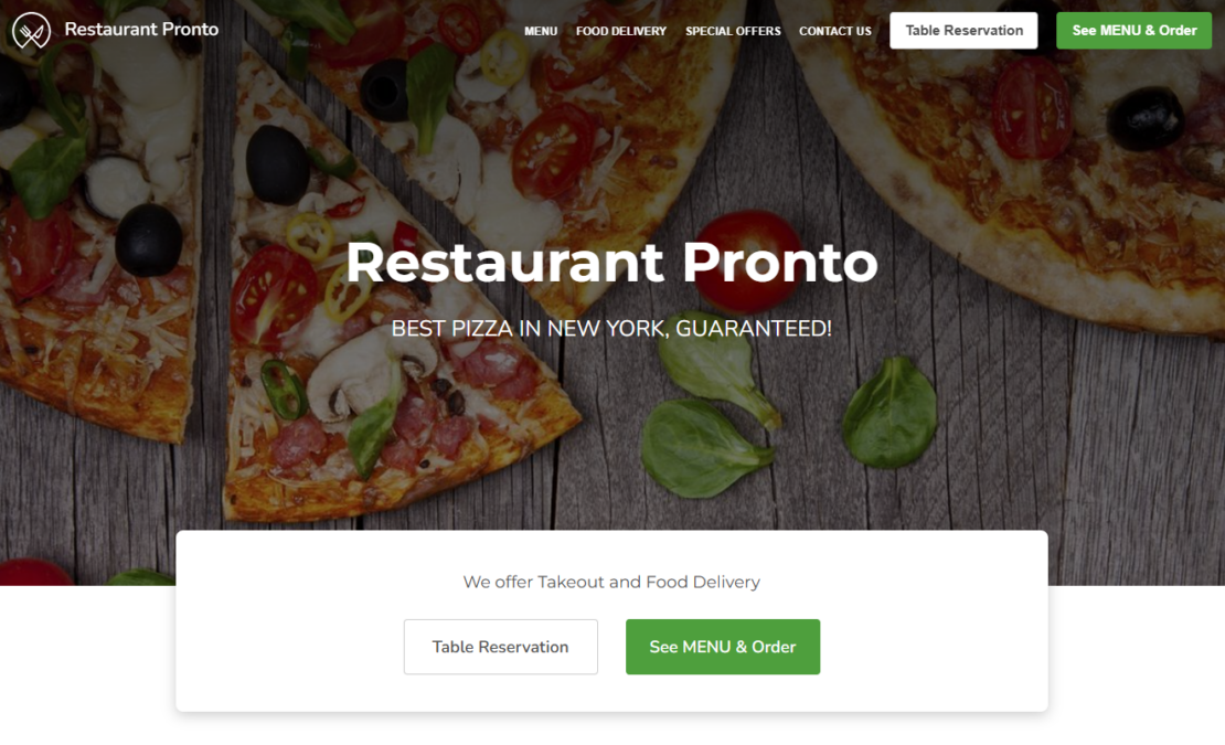
6. Make your headers work for you
Your front-page header is probably the first thing your client will see. Take advantage of it to get people to know more about your restaurant and encourage them to visit your online menu and order.
Check out these restaurant website design tips for headers:
- Use a contrasting color: you don’t want your headers to blend into the background, you want them to stand out to your customers;
- Use powerful Calls to Action: tell people what you want them to do, directly and persuasively. For example: “See Menu & Order”;
- Include keywords: to help with your SEO and rank you on the first page of Google, include keywords relevant to your type of cuisine and location. For example “Pizza Pronto New York. We serve the best Neapolitan Pizza, delivery and takeaway”.
7. Implement a visual hierarchy
Visual hierarchy is a term of web design that refers to how you place your elements on the page. You want to make your restaurant website design clear and effective. Use these tips to lead people to the elements you deem more important:
- Bigger elements will be seen first: people will scan your website first and not look at very small details and text. Therefore, your most important info such as name, menu, and location should be your biggest elements;
- Create “hot spots”: where you can draw attention to an element of the page where you need the user to look;
- Keep the basic information (who you are and what’s your specialty) as light as possible: stay clear from long descriptions and just mention at the beginning of your page your name and cuisine and it’s more than enough. You can be more descriptive lower on the page.
8. Make your content readable at a glance
You might have noticed that some of the most popular platforms online deal with images or very short videos. People like to be entertained, but they have a short attention span. Therefore, you must ensure visitors find what they are looking for at a glance.
Use these restaurant website design tips to make everything simple for customers:
- Opt for a one-page website design: you don’t need countless pages where customers can get lost. You can include all important info on a single and easily browsable page;
- Aim to reduce clicks: make it so customers can easily find what they need in 1-2 clicks. Go for a simple restaurant website design, without extra elements and pages that can distract the customers and cause them to exit the site out of frustration;
- Include your address somewhere visible: where it stands out, so clients know where to find you and not turn to another app to find your location
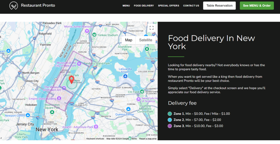
9. Leave space for integrations
After people are finished browsing your menu, reading your story, and admiring your pictures, you don’t want to let them go. You want to keep them engaged with your restaurant and persuade them to become part of your community.
You can do so by constructing your restaurant website design to include links to:
- Social Media: so they can interact with your restaurant with likes, comments and messages;
- Review Platforms: so they can see your positive reviews and be convinced to visit you.
How to get the best restaurant website design
You could go through the struggle of designing your website or hiring an agency, but what if we told you there was an easier way? What if you could get a restaurant website that follows all the rules listed above with no effort?
If you don’t want to take our word for it, try it yourself. Just follow these simple steps:
- Create an account on GloriaFood and fill in your restaurant’s basic info;
- Build an irresistible restaurant menu;
- Go to admin -> Setup -> Publish -> Sales optimized website and generate your restaurant website.
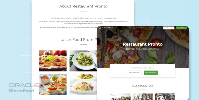
Here is a preview of how intuitive and conversion-centric your website will be once you go live.
Attract customers and guide them to the menu with a convincing restaurant website design
Generate your own restaurant website in less than 10 minutes
If you prefer video instructions, we got you:
Final Words
We hope you found these restaurant website design tips & ideas useful, and that you plan to implement them for your own website. If you want to learn more about how to increase conversion online, we recommend you read the following article:
How to Write a Menu for a Restaurant: Complete Guide with Examples

- What makes a good restaurant website
- 9 Restaurant website design tips & ideas
- 1. Always think mobile-first
- 2. Choose an efficient restaurant website color palette
- 3. Create contrast and maintain consistency
- 4. Make the menu the main focal point
- 5. Use mouth-watering images to increase conversion
- 6. Make your headers work for you
- 7. Implement a visual hierarchy
- 8. Make your content readable at a glance
- 9. Leave space for integrations
- How to get the best restaurant website design
- Final Words
Related topics