- 1. Create a restaurant website design that increases conversion
- 2. Prioritize mobile users
- 3. Attract customers with a mouth-watering image gallery
- 4. Allow people to order directly on your website
- 5. Have an enticing menu that persuades people to order
- 6. Add Calls-to-actions throughout your content
- 7. Show people how they can easily reach you
- 8. Let people know more about your restaurant
- 9. Include links to social media and review platforms
- 10. How to implement all restaurant website best practices in just 10 minutes
- Conclusion
Having a restaurant website for your food business is no longer optional, it’s a must. 77% of respondents to a study declared they check the website before visiting a restaurant and the way it looks and works will majorly influence their decision.
If you want to increase your online visibility and convince visitors to become clients, we have come up with a series of restaurant website best practices you must follow.
Check out this easy-to-implement guide full of tips and solutions for a successful online business:
1. Create a restaurant website design that increases conversion
When you talk about restaurant website best practices, your first thought will surely be about design because it is the first thing a visitor notices. The main rule is that the best restaurant website design is a blend of form and function, that persuades people to become your clients.
Here are a few pointers that will help you increase your conversion rate:
- Keep it simple and concise: don’t overcrowd your design with many elements that will distract visitors from the most important part: the food. Not to mention that if the page has too many items, it will load very slowly and may cause some people to exit it and look for another option;
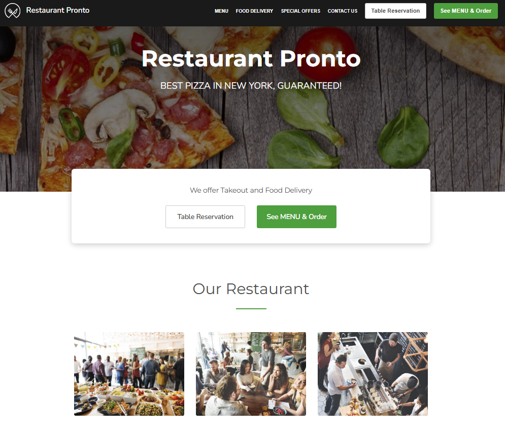
- Make the menu button visible: the first thing people look for on a restaurant’s website is the menu. They want to know what you are offering and the prices. Ensure you have a menu button in a contrasting color to the background, and place it on the right side, above the fold, for maximum visibility;
- Have your contact information easily accessible: your NAP (name, address, phone number) should be placed in key places where people expect them to be (on the contact page, at the bottom of pages) to help clients find you and increase your chances to rank high in Google searches.
2. Prioritize mobile users
53% of diners use their smartphones to find a restaurant location. Hunger strikes at any time, and it usually happens when you are not in front of a desktop.
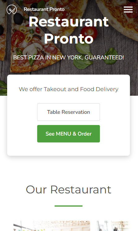
Therefore, if you want to increase your online visibility you need a website that is optimized for mobile devices. The screen and element’s size must adapt automatically, and everything must load fast, nobody has time to waste.
While you’re at it, ensure your menu is easily browsable on mobile as well. Clients should be able to place an order in just a few clicks. A menu that doesn’t fit on the screen with lopsided images will only frustrate potential clients and make them look elsewhere.
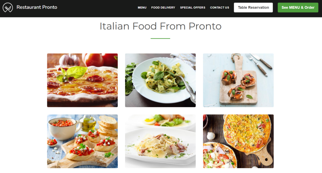
3. Attract customers with a mouth-watering image gallery
You can describe your cuisine, your dishes, and your ingredients in as many words as you want, but the photos are the ones that will ultimately convince people to try your food.
Therefore, ensure your restaurant website has a beautiful image gallery that features all your delicious dishes photographed professionally. You can also add photos of your restaurant’s interior, exterior, and atmosphere to convince people to visit your location.
4. Allow people to order directly on your website
Online ordering has been an increasing trend in the last few years, and it is not predicted to go down. Gone are the days when people had to place orders by phone, risking too many errors and wasting time.
If you want to follow the restaurant website best practices, you need to have more than a display online location, you need a restaurant website with online ordering.
People must be able to order just by clicking the menu button, browsing the restaurant menu, adding the desired items to the cart, and following the check-out steps. This way, you not only give people the best and easiest way to order, but you also increase your sales by extending your business online.
Make online ordering fast an convenient for your clients
You only need 10 free minutes to create a restaurant website with online ordering
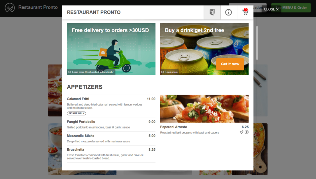
Remember the old PDF menus that took a long time to download, were very hard to browse, and were barely readable? They must become a thing of the past!
People want a menu that is easy to browse, organized in categories, and allows them to order directly. If you add some hunger-inducing photos and attractive menu item descriptions, you will surely gain some new customers!
On top of that consider adding other features that make life easier for your clients, such as:
- Ways to personalize a dish, like different sizes for a pizza and a variety of toppings;
- Nutritional information;
- Allergy information;
- Mark menu items that fit a specific diet such as Vegetarian, Vegan, or Raw.
6. Add Calls-to-actions throughout your content
Some of the most important restaurant website best practices related to content are to optimize your content for search engines but also use persuasive wording that will determine visitors to take the big steps and become your clients.
Therefore, ensure your content is full of naturally inserted keywords related to your location and type of cuisine, and calls to action to encourage people to order or visit your restaurant. Here are some places you should not miss:
- The menu button is a great way to attract people. Go for direct messages such as “See menu & order”;
- In the “About Us” section, after you tell people about your history, invite them to try your dishes;
- When you launch a new menu item, promote it in a banner and encourage visitors to order for an unforgettable culinary experience;
Generate persuasive and SEO-optimized content without the effort
Use this restaurant website builder to get an already sales and SEO-optimized website
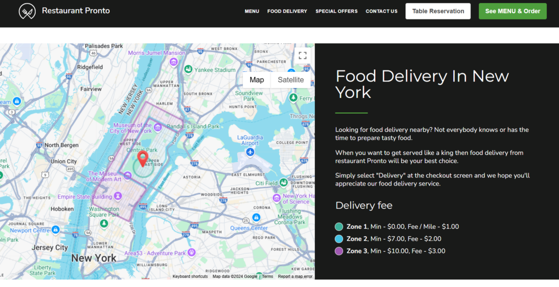
7. Show people how they can easily reach you
Your restaurant website can help you fill more of your tables, but first, you have to show people how to reach your location. An easy to give people as many details as possible is to add a map on your website.
This way, people can use landmarks in the area to get a better idea of how to reach your place. You can also use it to showcase your delivery zones, so people know at a glance if they can order from your place.
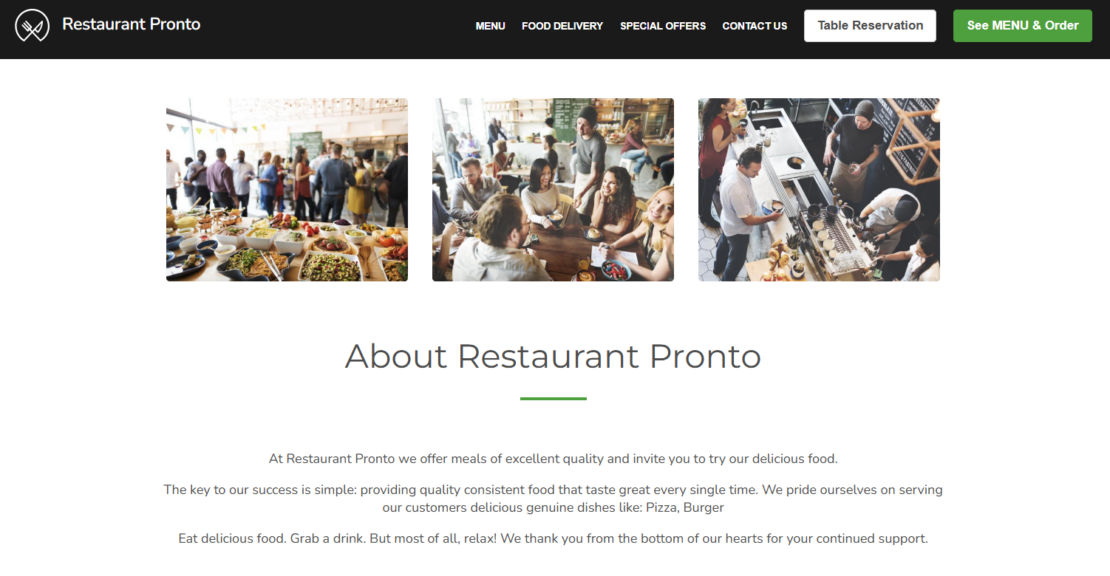
8. Let people know more about your restaurant
Your website also gives you the opportunity to let people know a bit more about your business. Take advantage of the “About us” section to give interested clients information about:
- Why you opened your restaurant
- What is your restaurant’s history, is it a family business?
- What are you passionate about?
- Do you use special ingredients?
Don’t let people just leave your website, keep them close to your business by including links to your social media. There, they can get to know more about your food, interact with you, and who knows, even become recurring clients.
Furthermore, make it easy for customers to leave you positive reviews by adding links to the review platforms you are on, such as TripAdvisor and Yelp.
10. How to implement all restaurant website best practices in just 10 minutes
Building a restaurant website from 0 can seem intimidating. Will you need technical knowledge to make it mobile-friendly and install an online ordering system? Will you need copywriting courses to write powerful calls to action and insert SEO keywords?
The answer is no, you just need ten free minutes. Sign up on GloriaFood, go through the short-up setup process, and generate your sales-optimized website. Check out the video instructions:
The website you will create will come with:
- SEO content customized to your business with convincing calls to action
- An online ordering system that makes it easy for anyone to order
- An easy-to-use menu that persuades people to order
- A one page-template designed for increased conversionMobile-friendly design
- A gallery full of enticing images
- A widget for map insertion
- The possibility to add links to social media and review platforms
If you don’t believe us, check out this model website that offers clients an amazing experience that persuades them to return.
Conclusion
Following the restaurant website best practices presented above will ensure you will get more online visibility, more customers, and more sales. There is no reason to wait, generate your sales and SEO-optimized restaurant website now!

- 1. Create a restaurant website design that increases conversion
- 2. Prioritize mobile users
- 3. Attract customers with a mouth-watering image gallery
- 4. Allow people to order directly on your website
- 5. Have an enticing menu that persuades people to order
- 6. Add Calls-to-actions throughout your content
- 7. Show people how they can easily reach you
- 8. Let people know more about your restaurant
- 9. Include links to social media and review platforms
- 10. How to implement all restaurant website best practices in just 10 minutes
- Conclusion
Related topics